DESIGN INSPIRATION
Font History Poster
Classic Serif
Timeless & Traditional
Modern Sans-Serif
Contemporary & Clean
Handwritten
Personal & Approachable

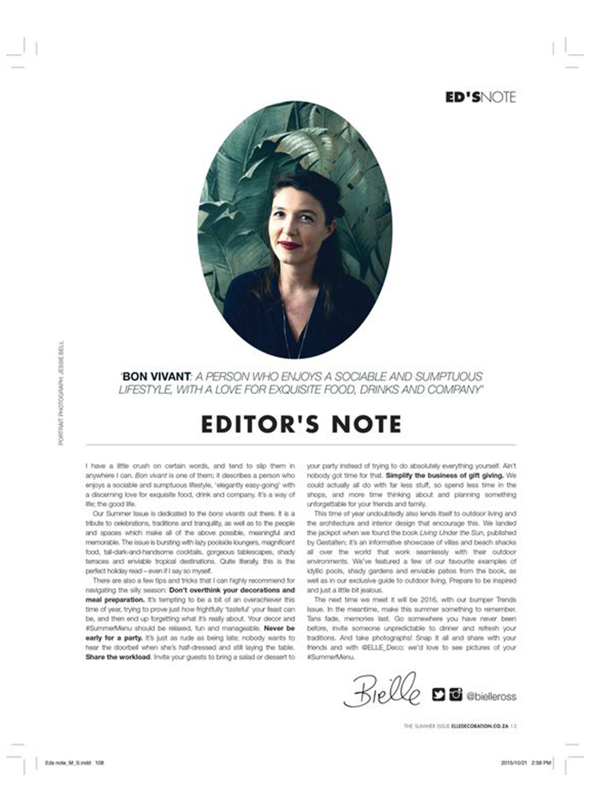
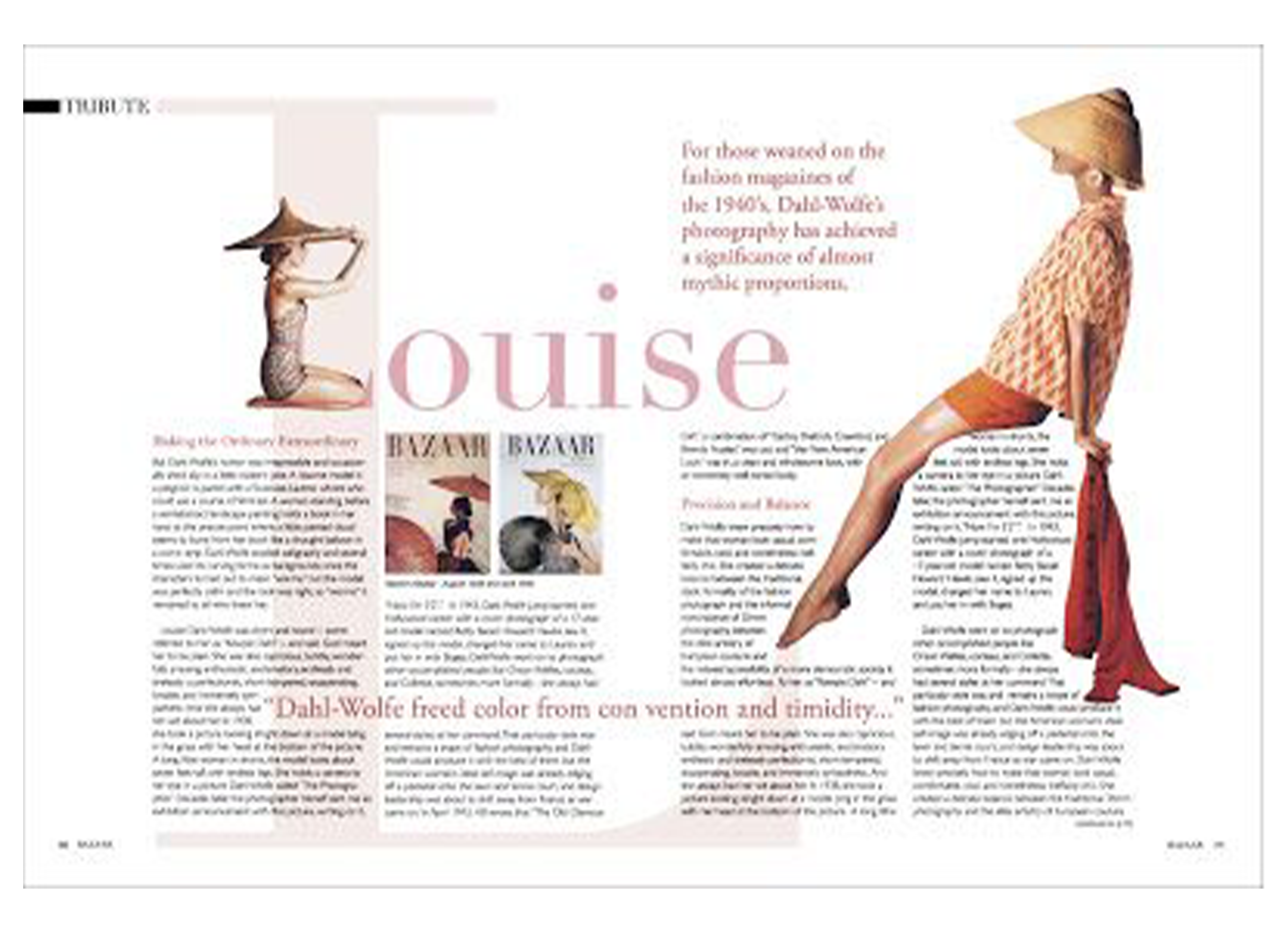
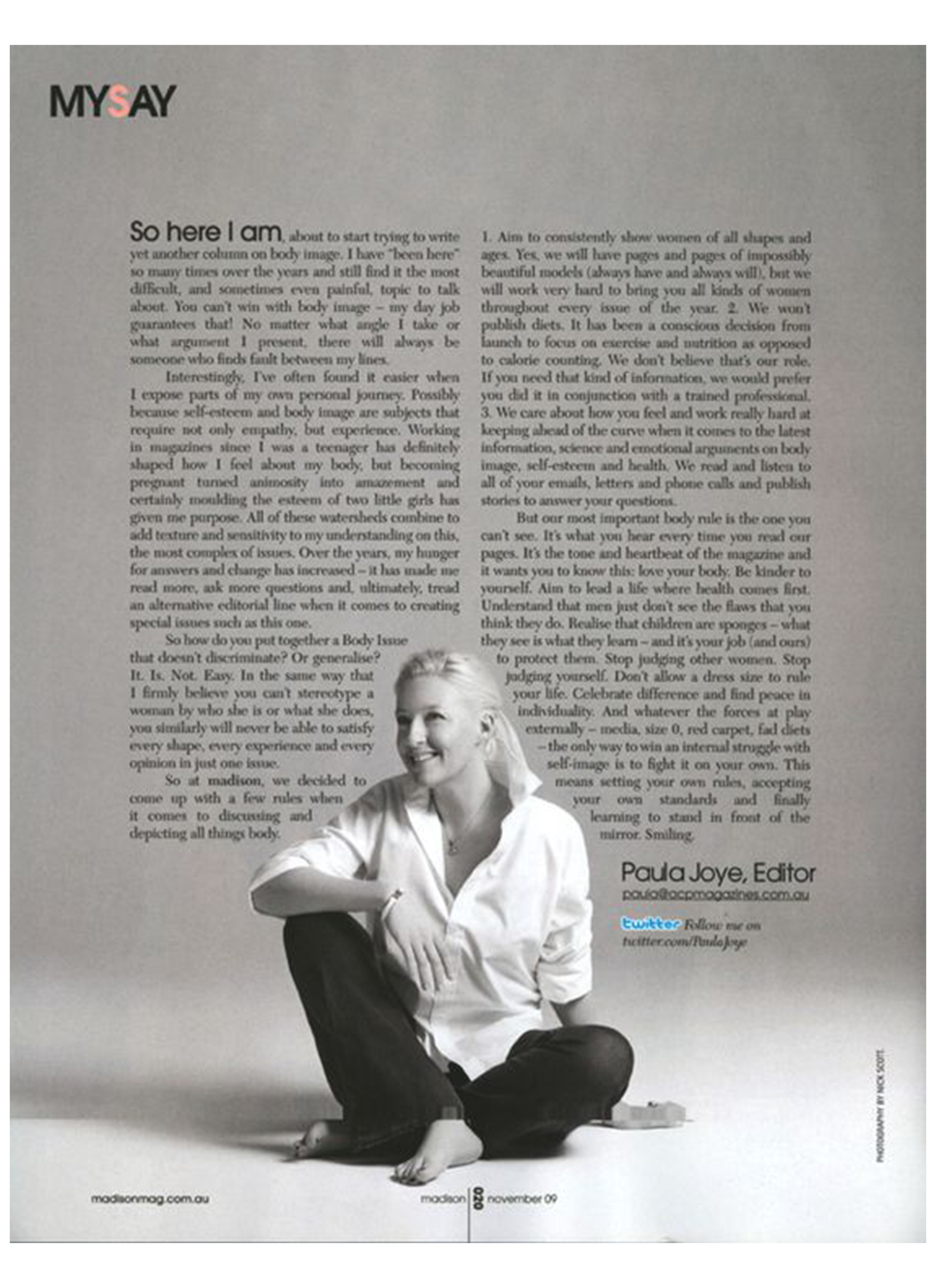
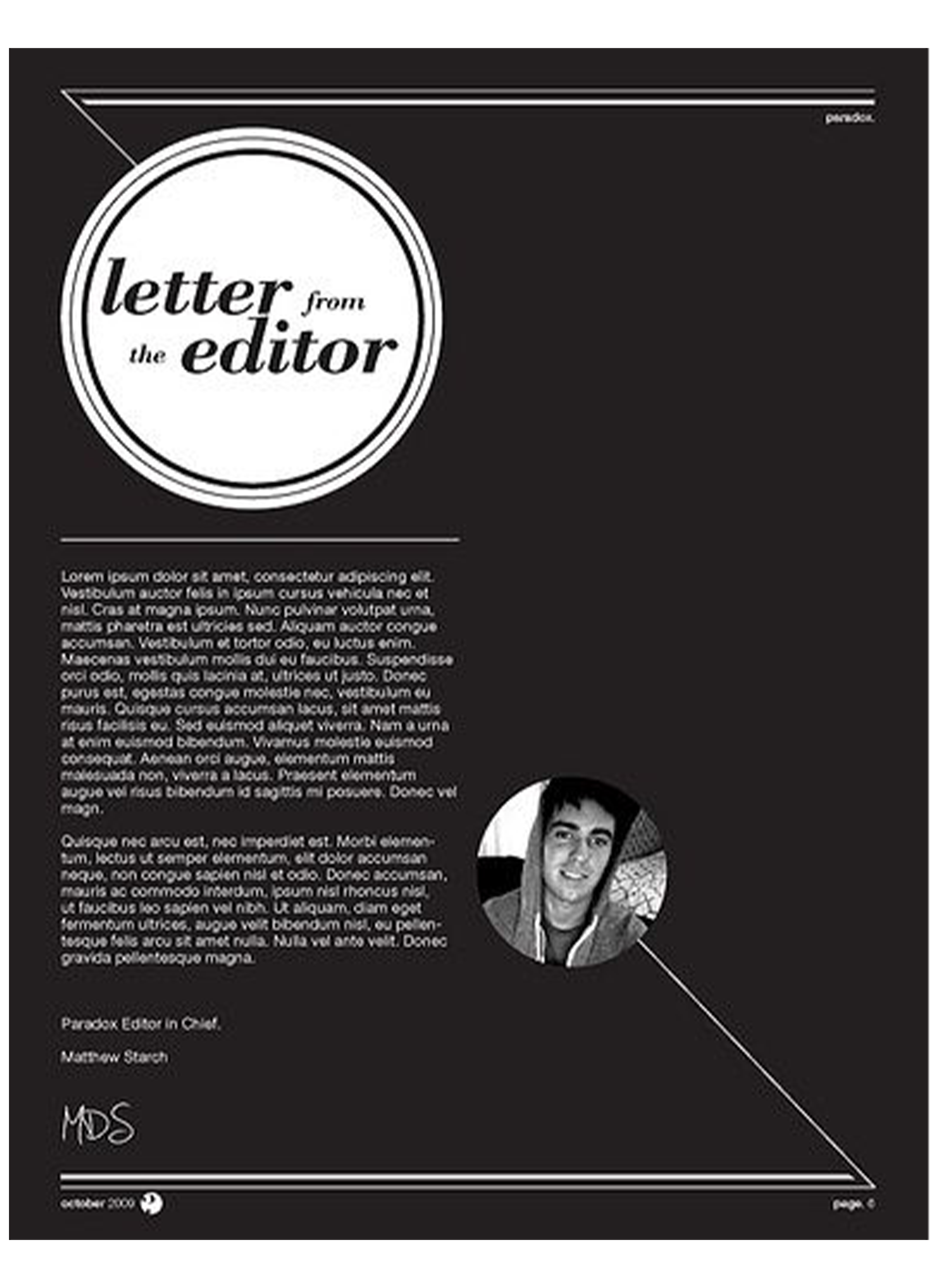
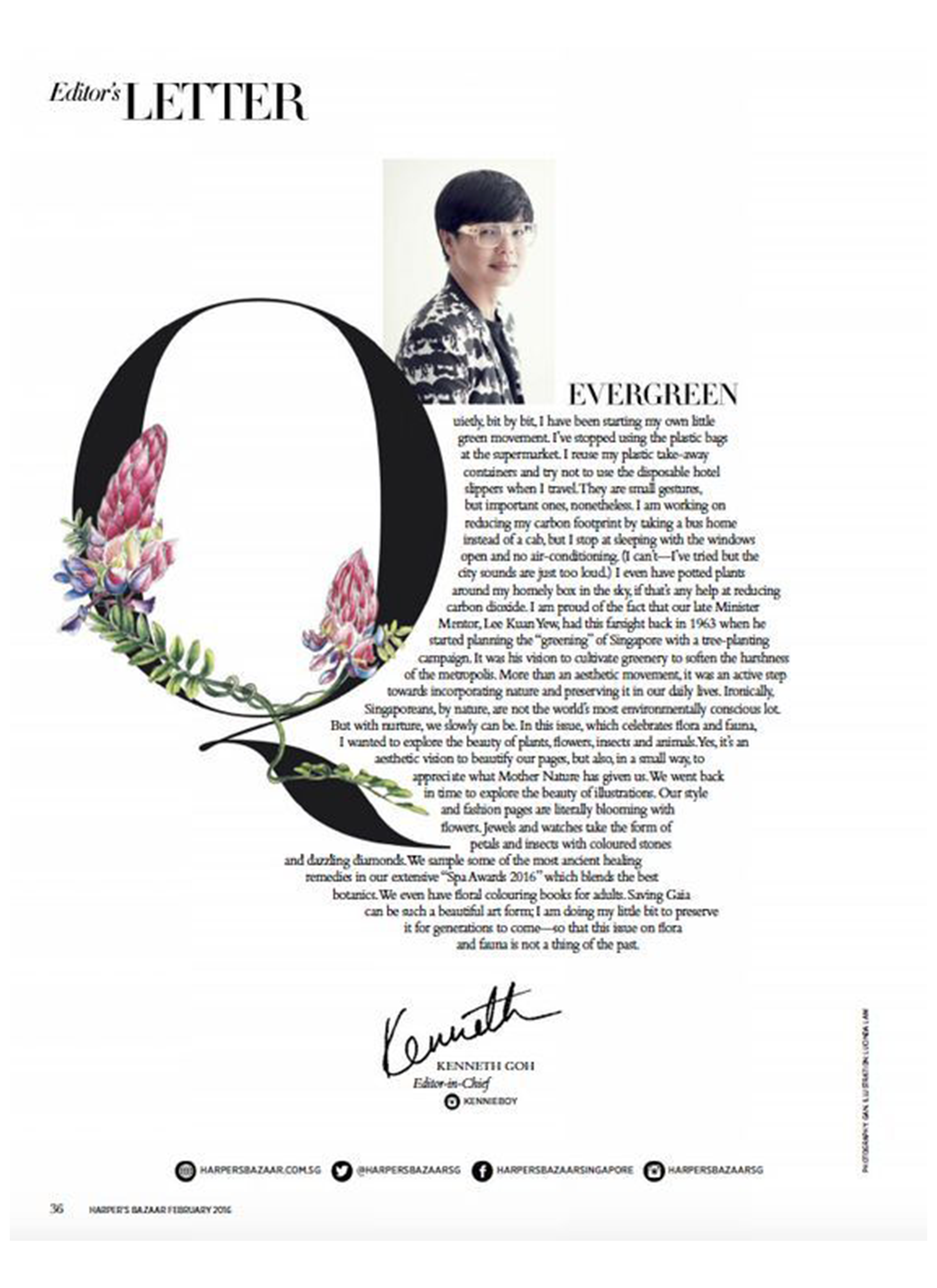
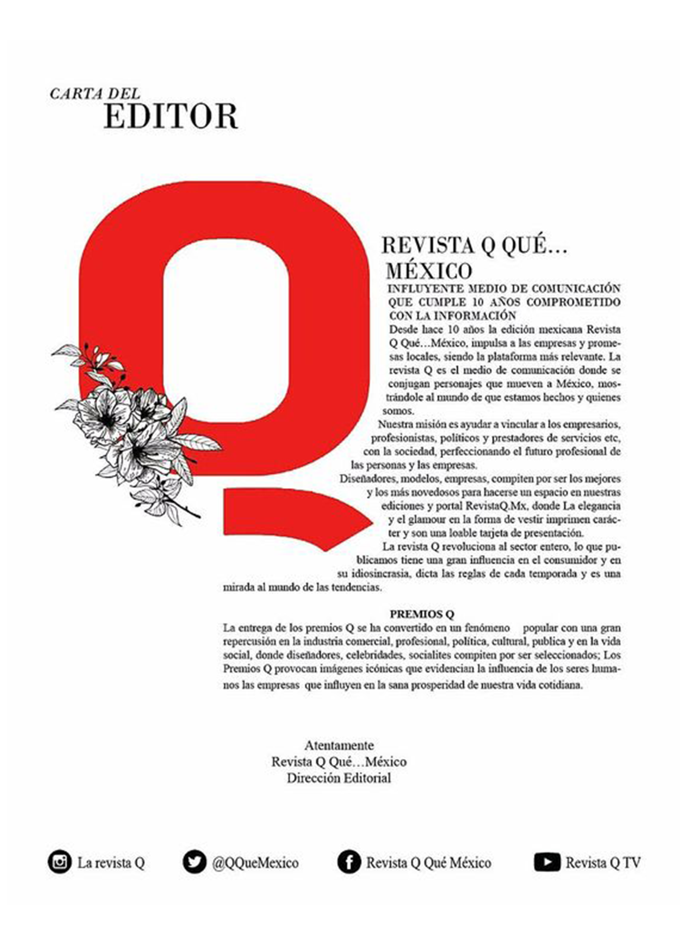
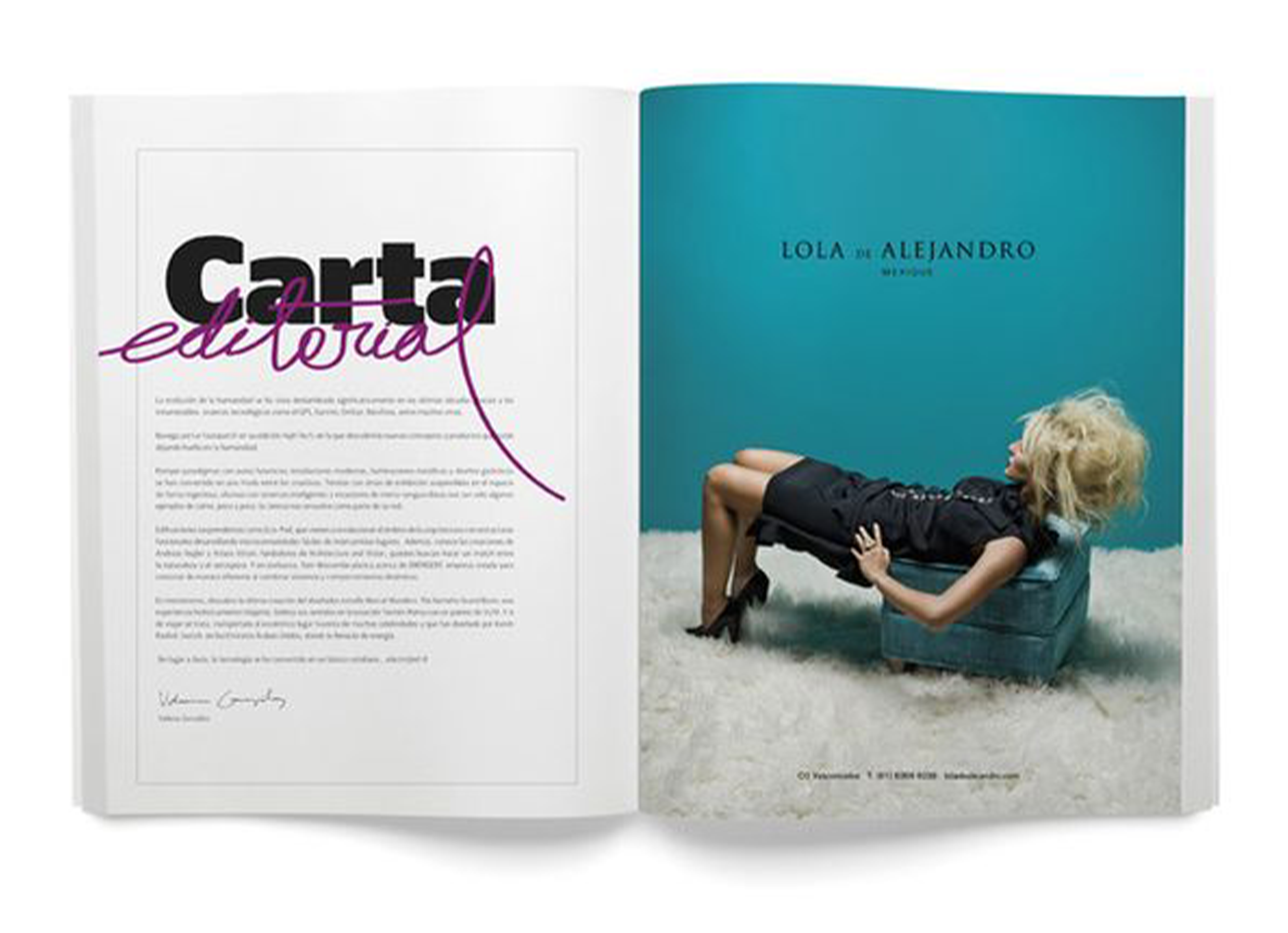
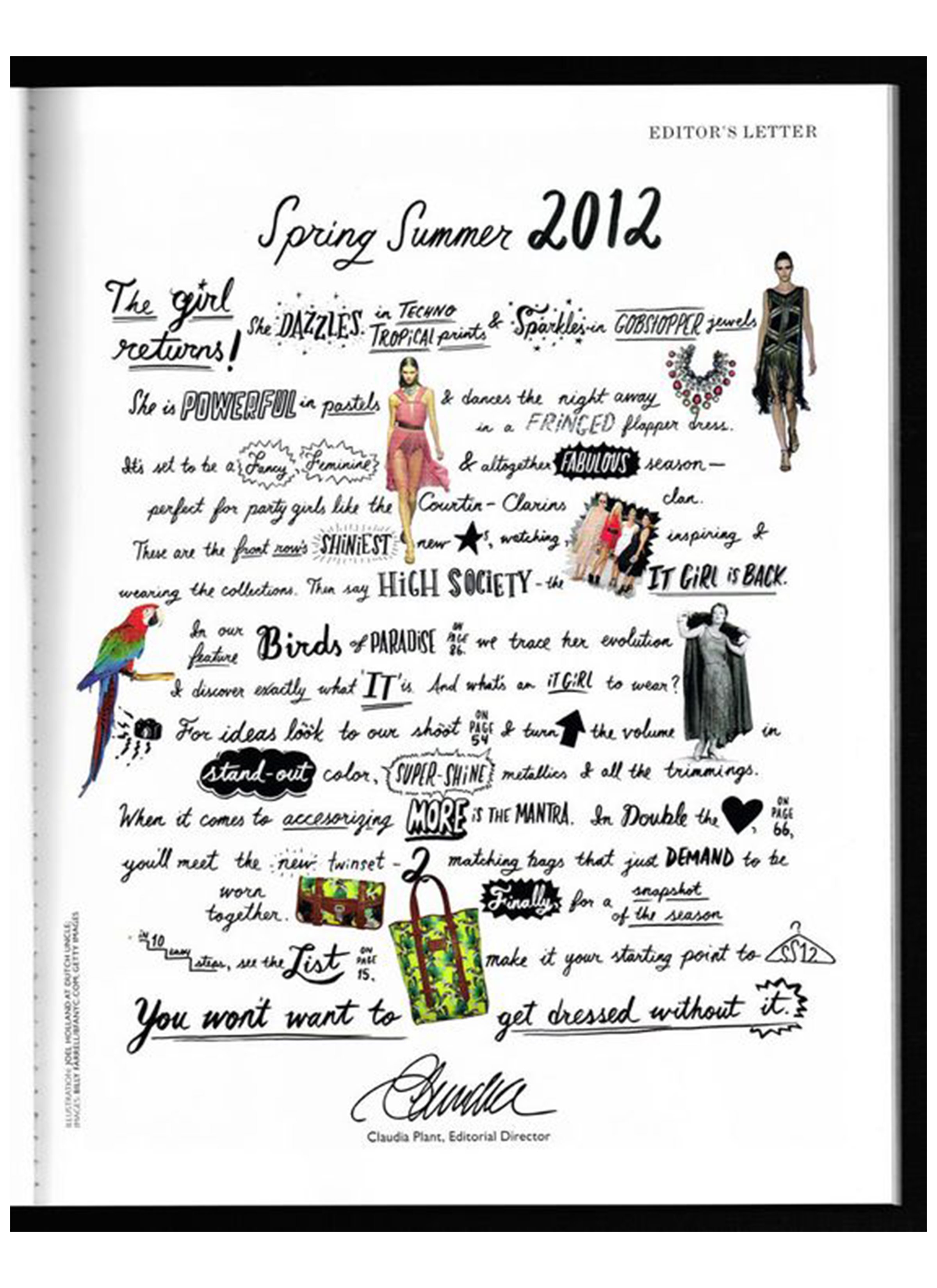
Begin by selecting a font that reflects the magazine’s identity and the intended tone of the letter. Consider the personality of the chosen typeface—whether it’s a classic serif for a formal touch, a modern sans-serif for a sleek appearance, or a handwritten script for a more personalized feel.
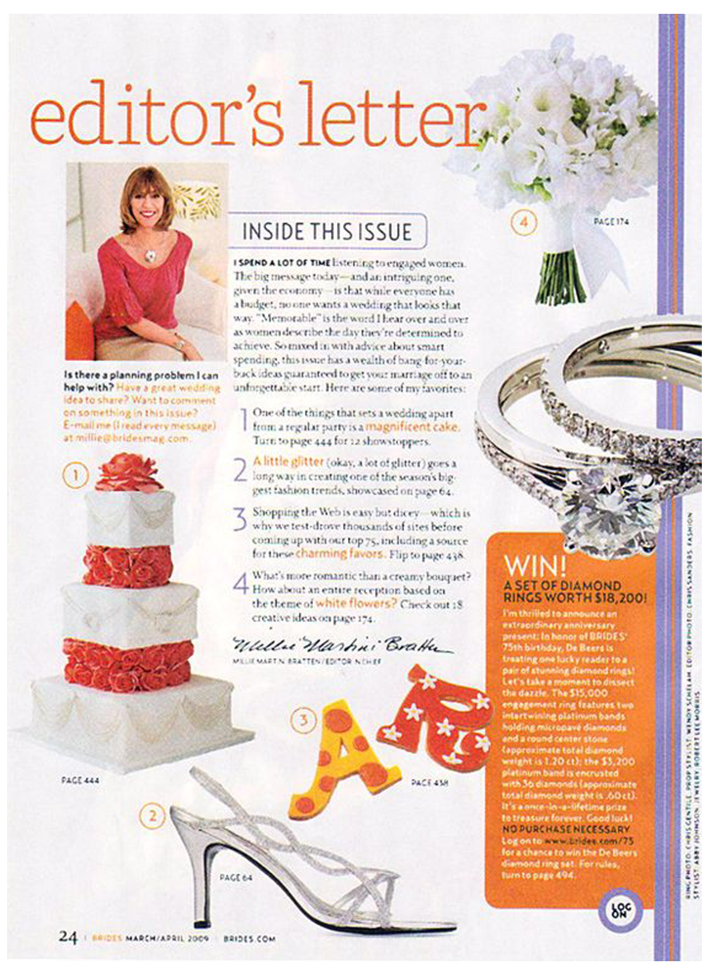
Pay attention to factors such as font size, spacing, and alignment to ensure optimal readability. Experiment with layout and hierarchy to emphasize key points or create a visual flow that guides the reader through the letter seamlessly.
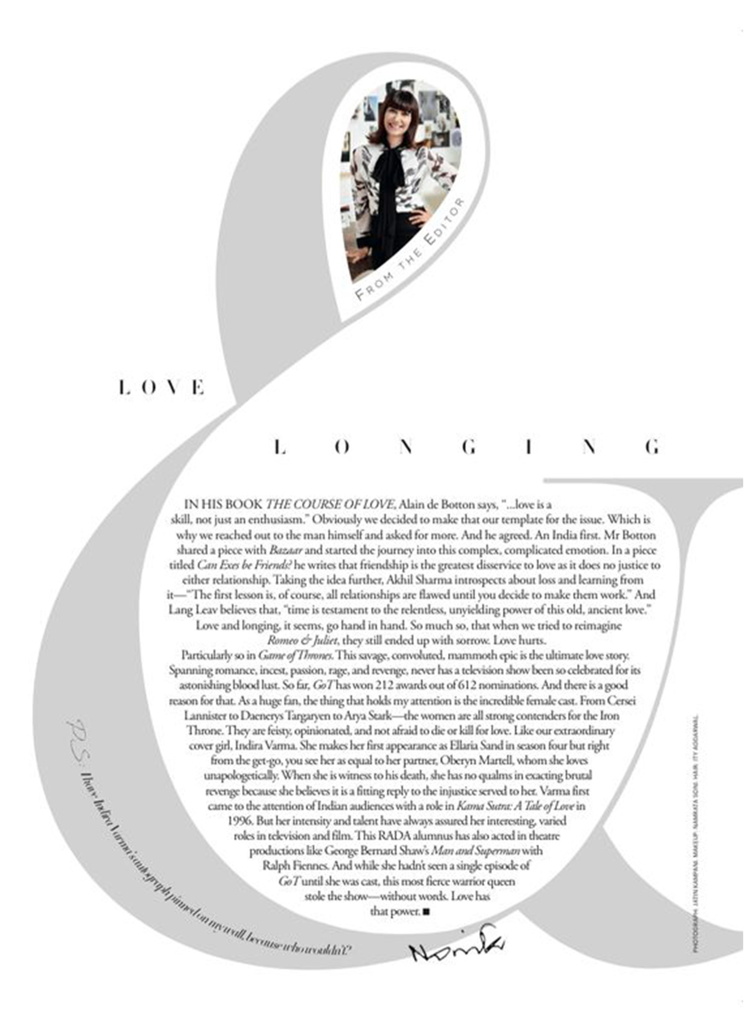
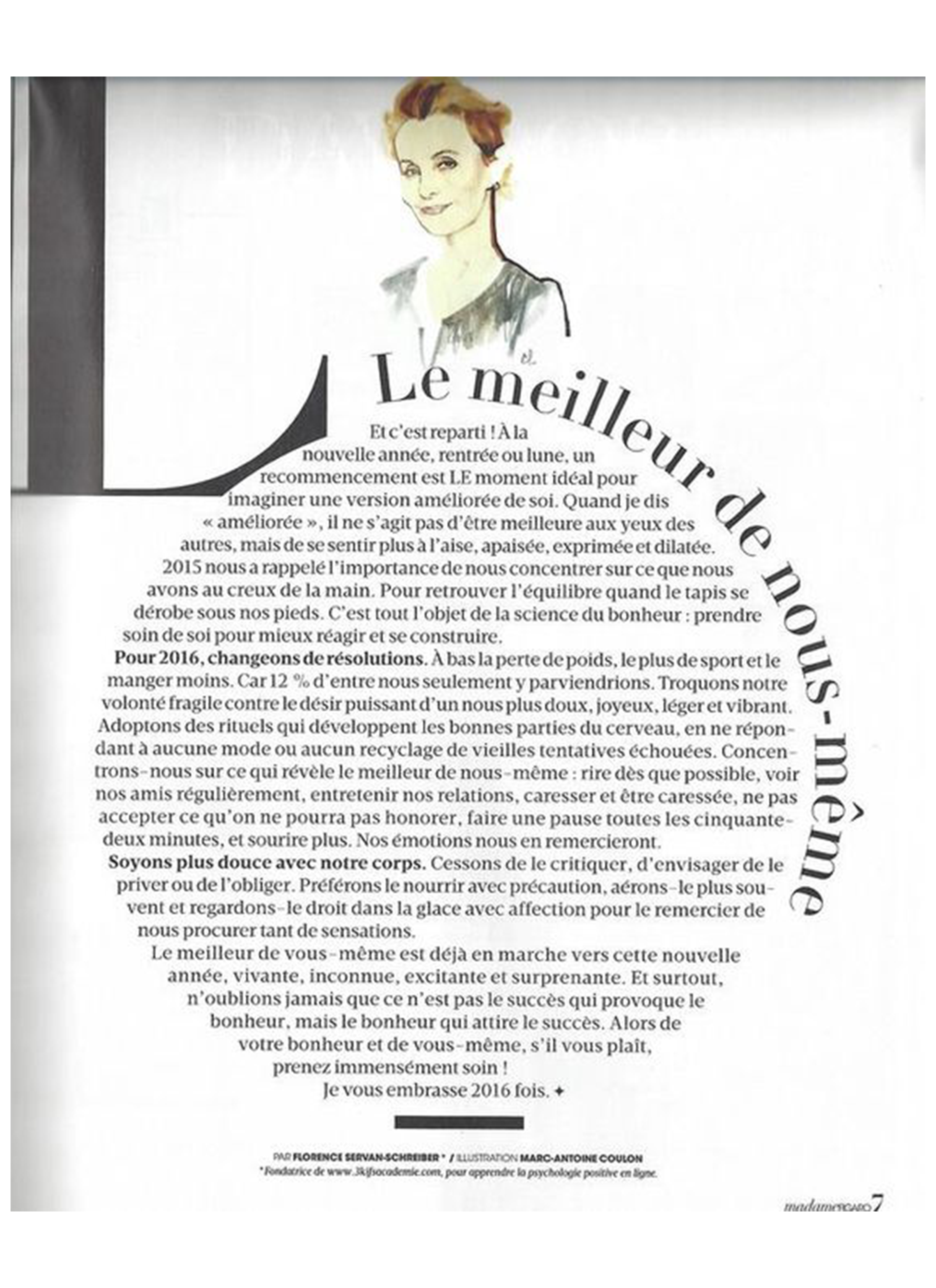
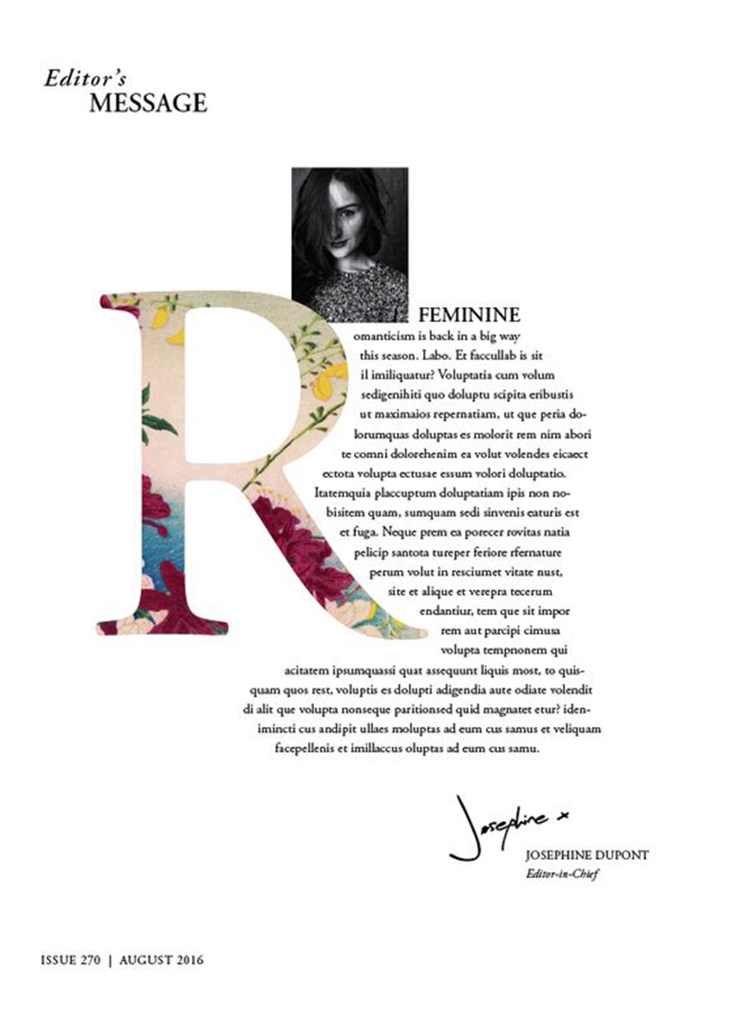
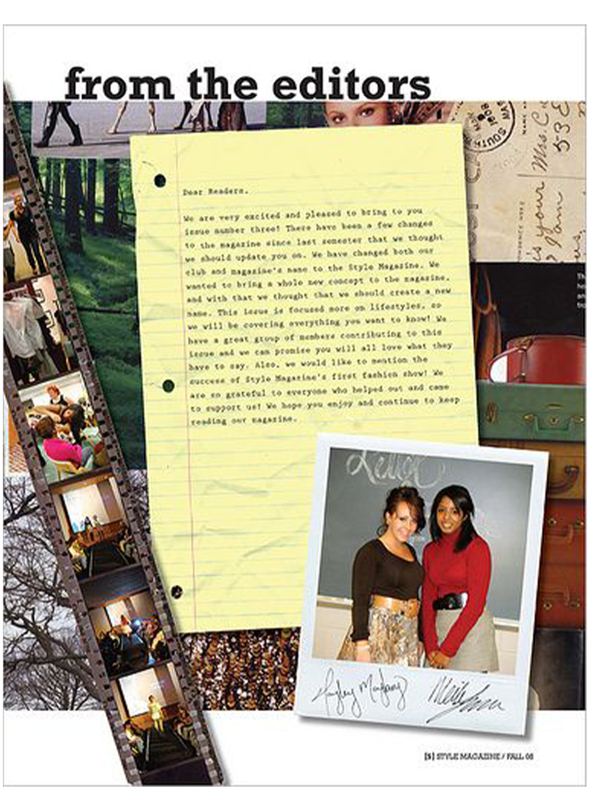
For a collaborative touch, students will personalize the letter by including the names and photos of all group members. Strategically integrate the images into the typographic design by using a grid layout or creatively incorporating them within certain letters or elements.
This not only adds a human touch but also establishes a sense of transparency and connection between the editorial team and the readers. Ensure the overall design is cohesive, with a balance between text and visuals to create an engaging and aesthetically pleasing letter from the editor that reflects the collaborative effort of the entire group.
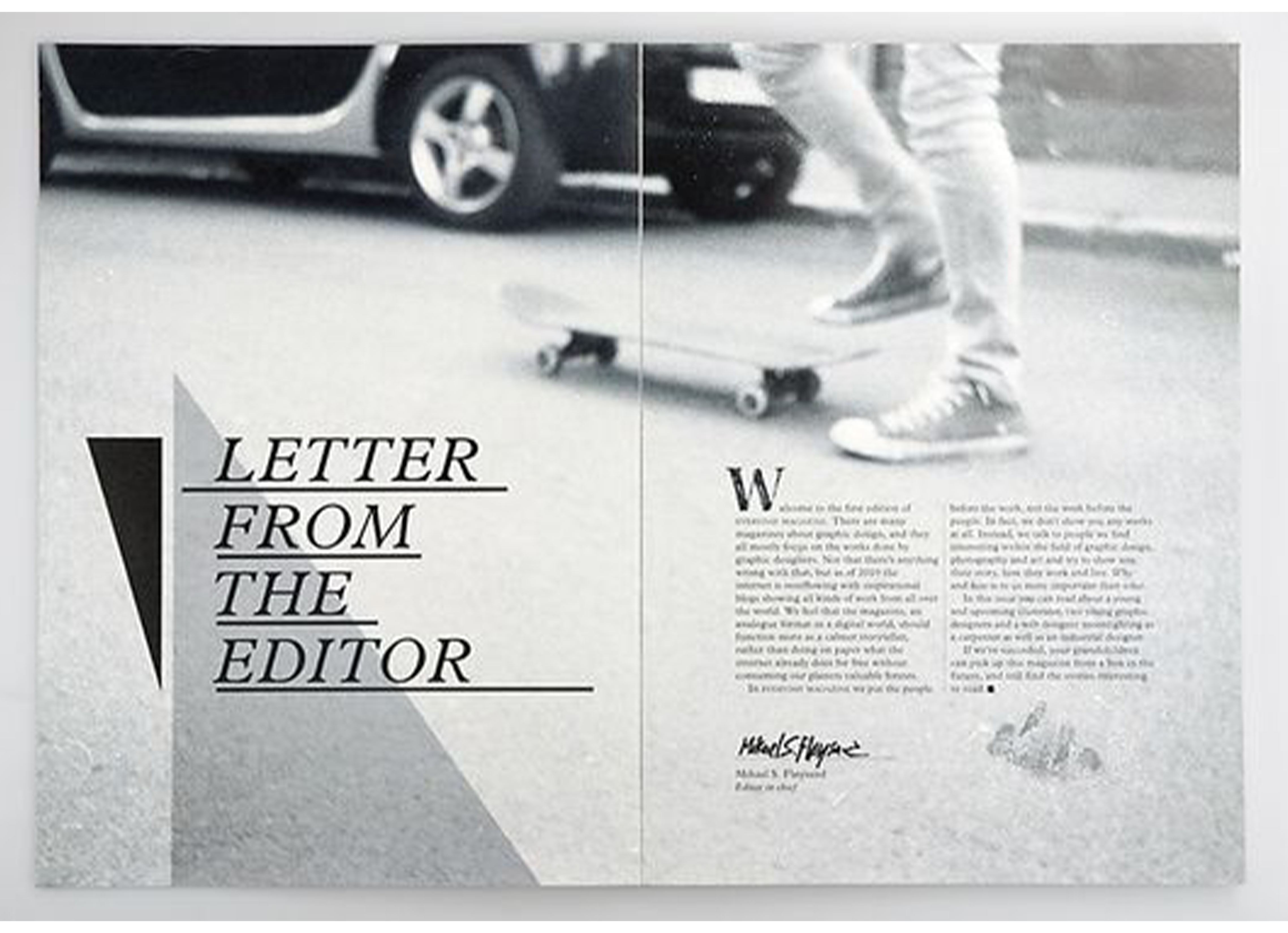
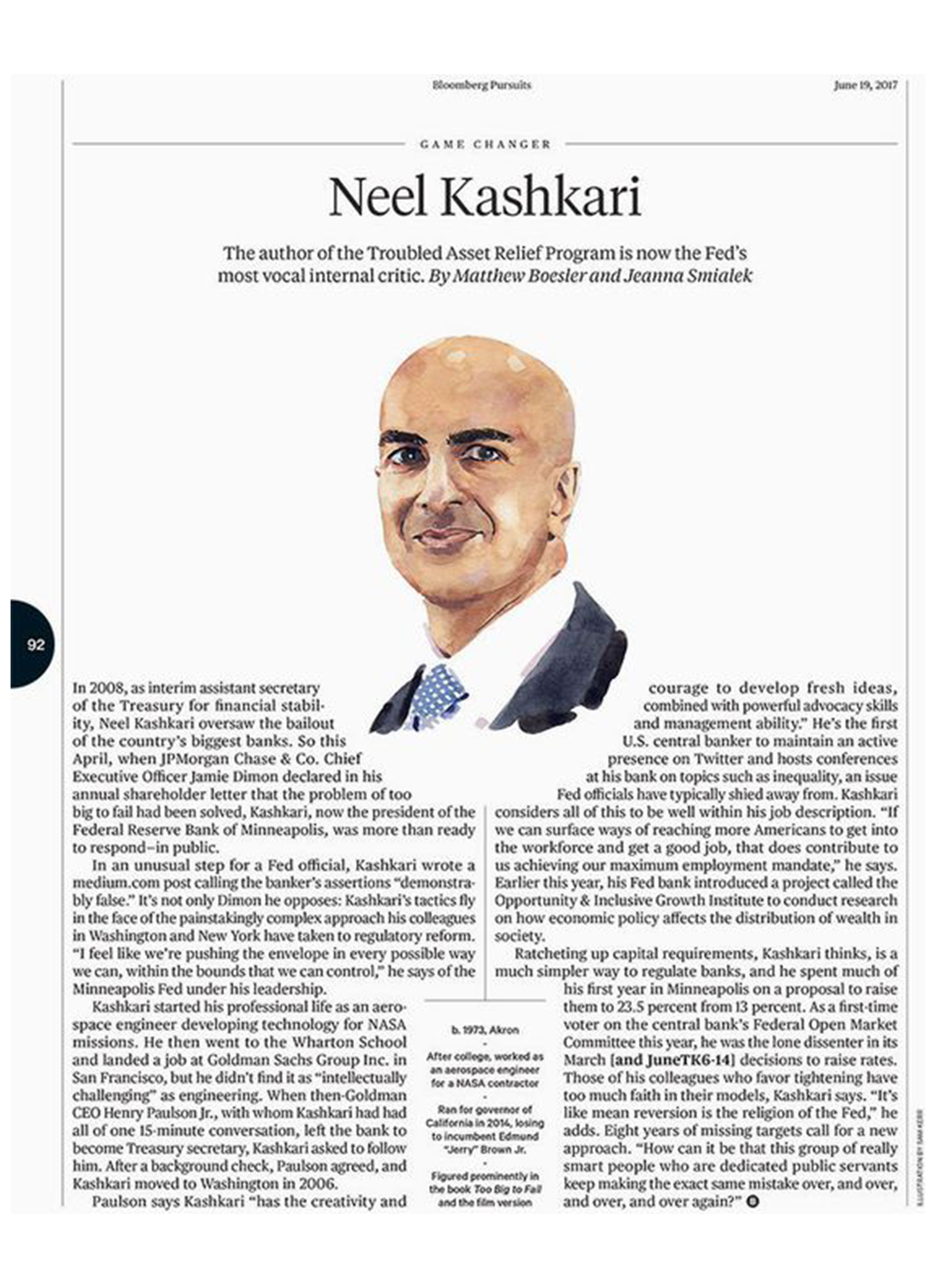
Letter from the Editor Examples
Magazine Project
Letter from the Editor
When designing your letter from the editor with a typographic focus, carefully select a font that not only resonates with your magazine’s character but also enhances readability; consider incorporating a personal touch, such as names and photos, to forge a genuine connection with your readers.

