DESIGN INSPIRATION
Three Magazine Ads
Strategy
Target Market
Differentiator
Communication
Big Idea
Solve a Problem
New Way of Viewing
No Mediums
Execution
They Zig, You Zag
Clean and Organized
In their Branding

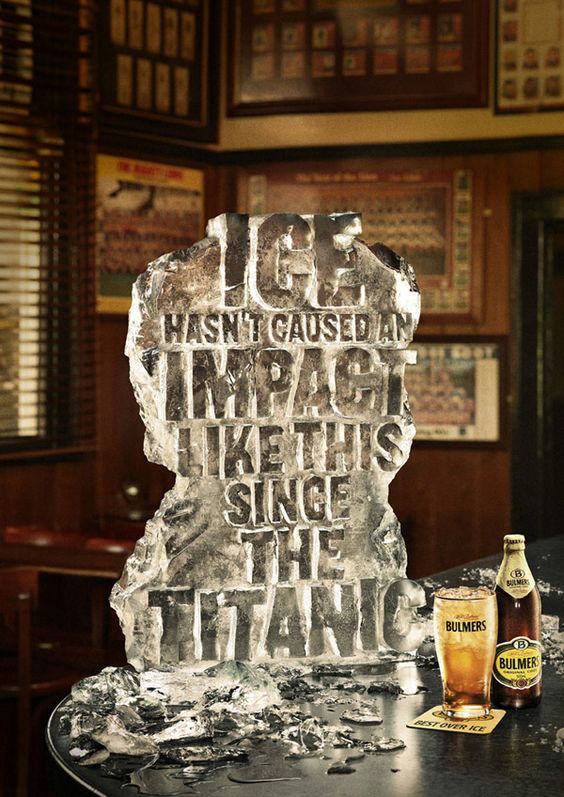
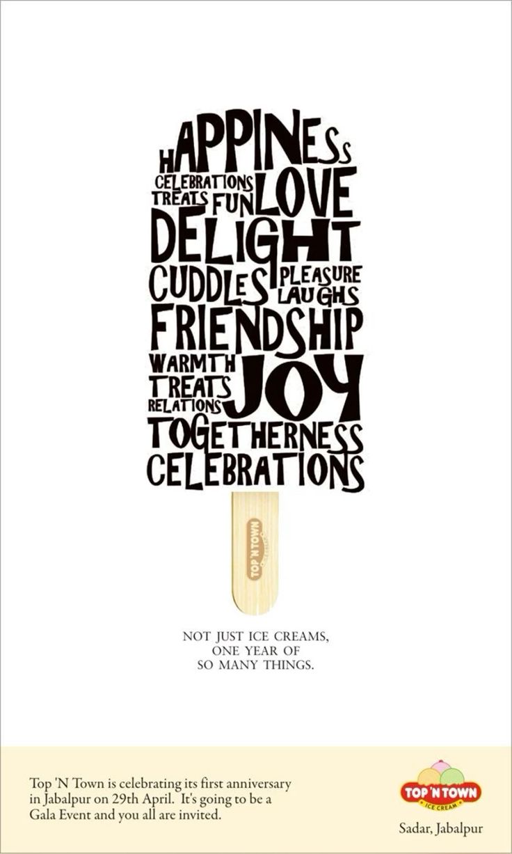
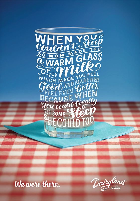
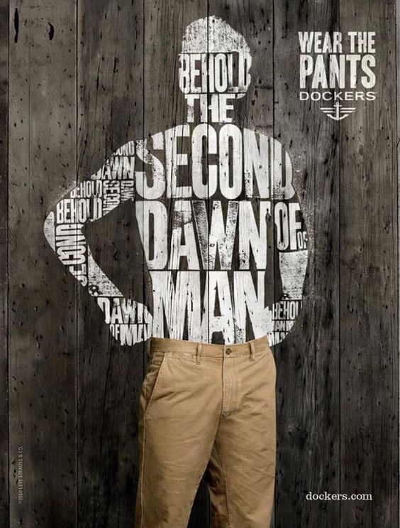
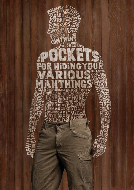
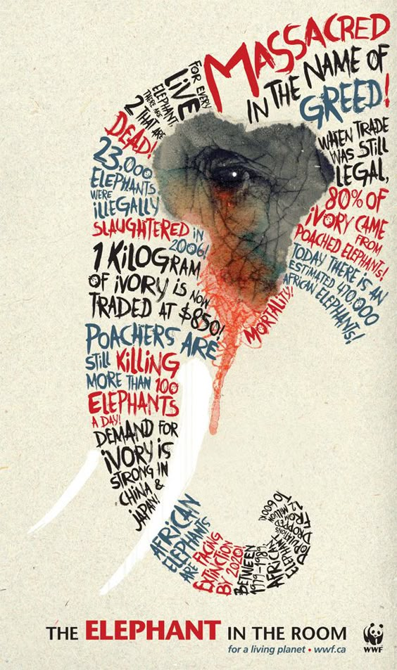
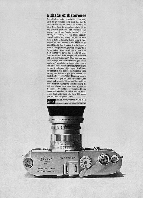
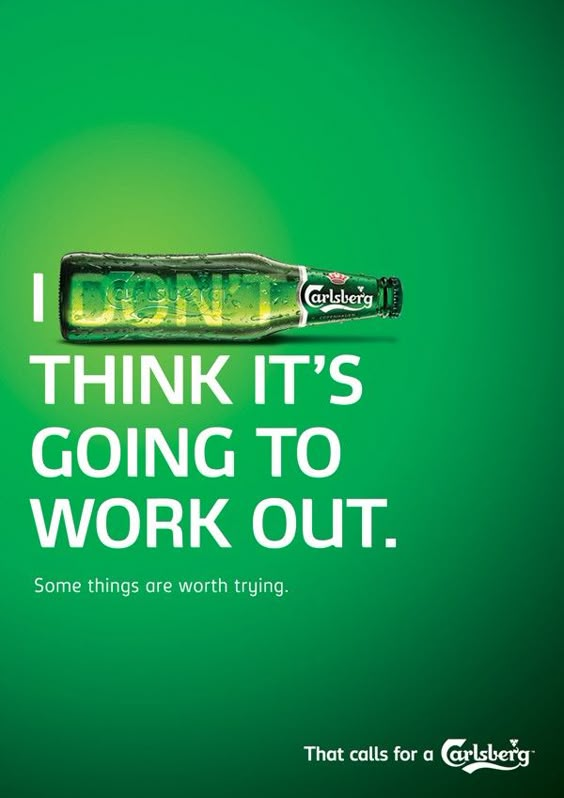
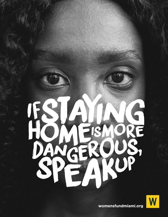
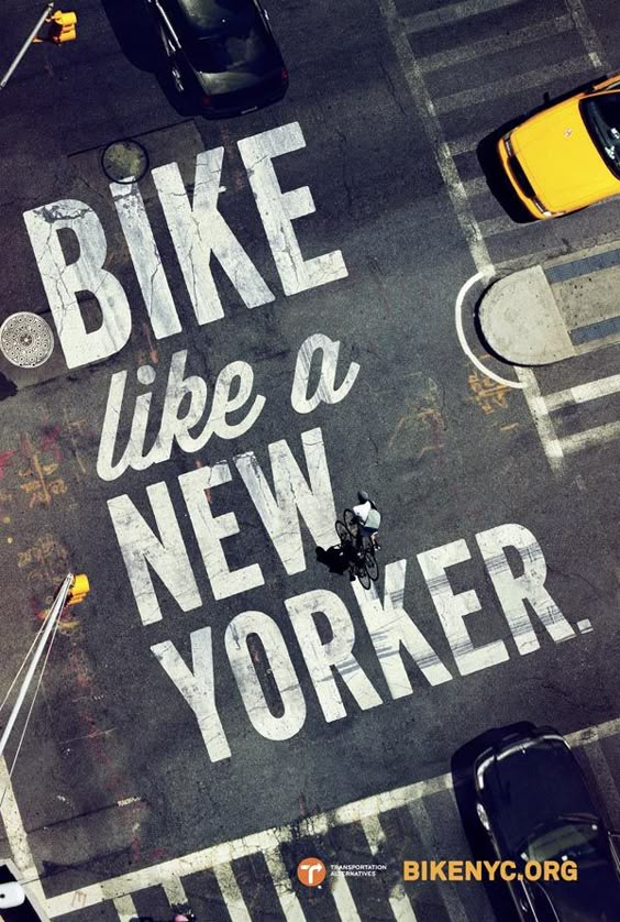
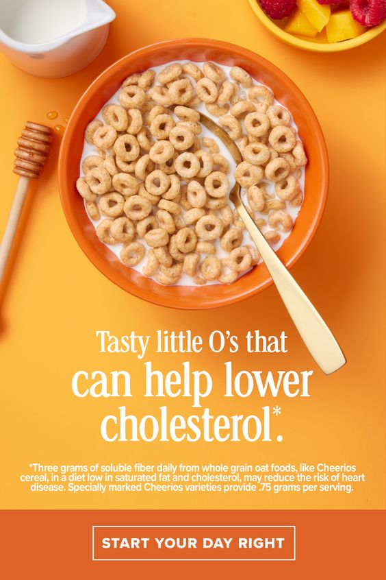
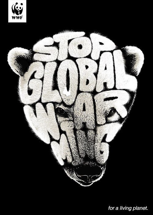
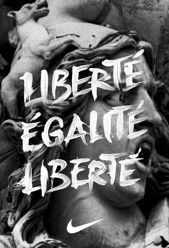
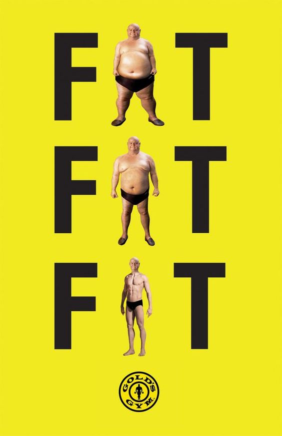
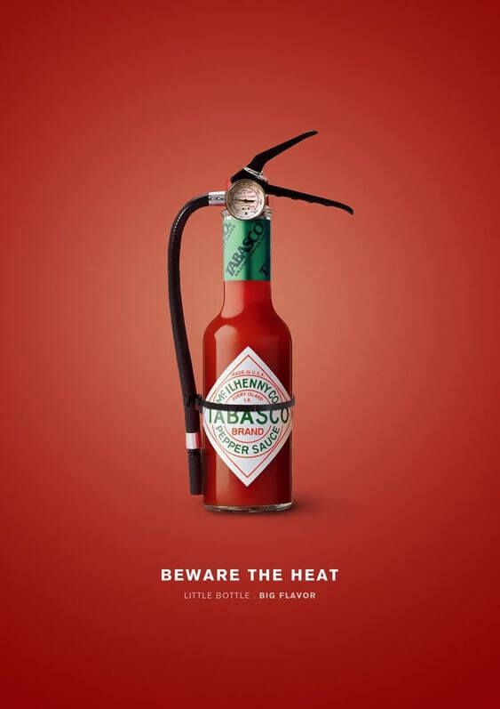
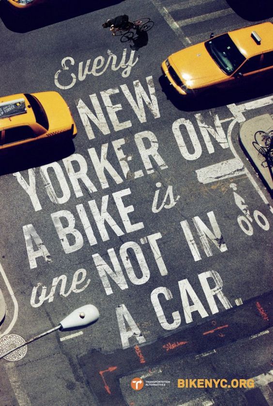
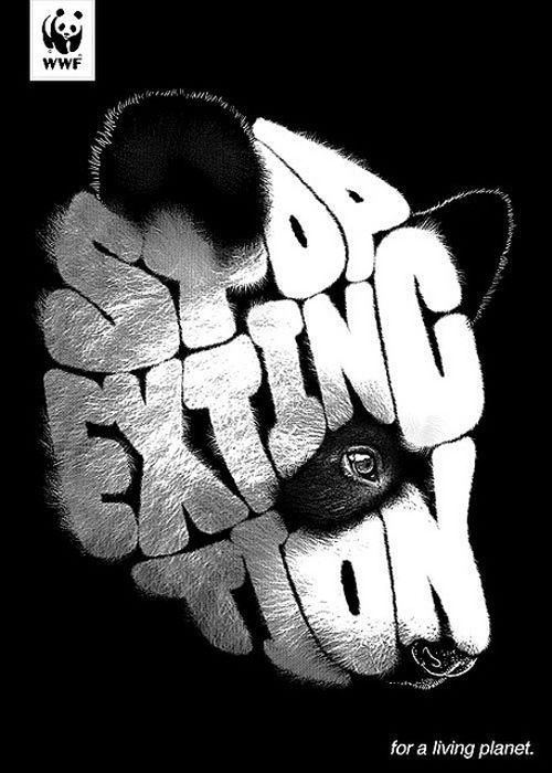
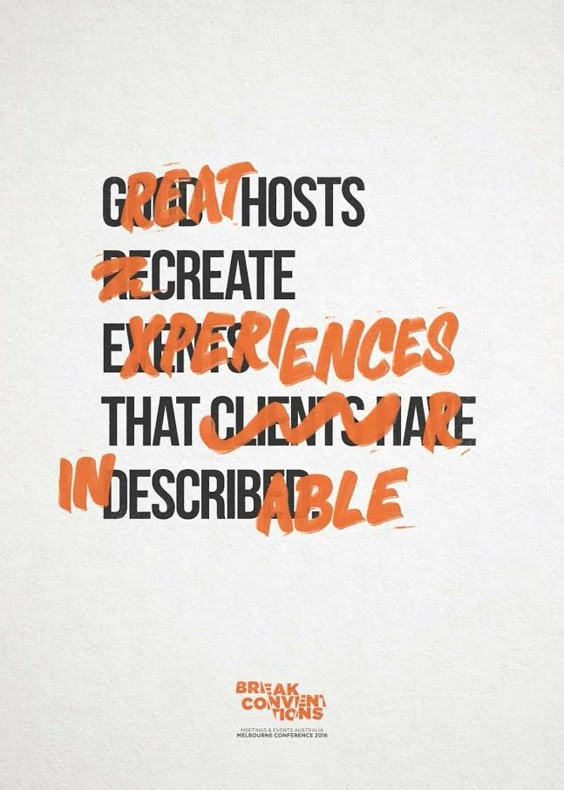
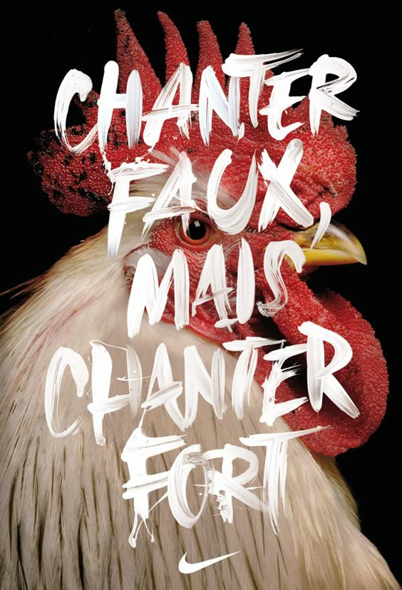
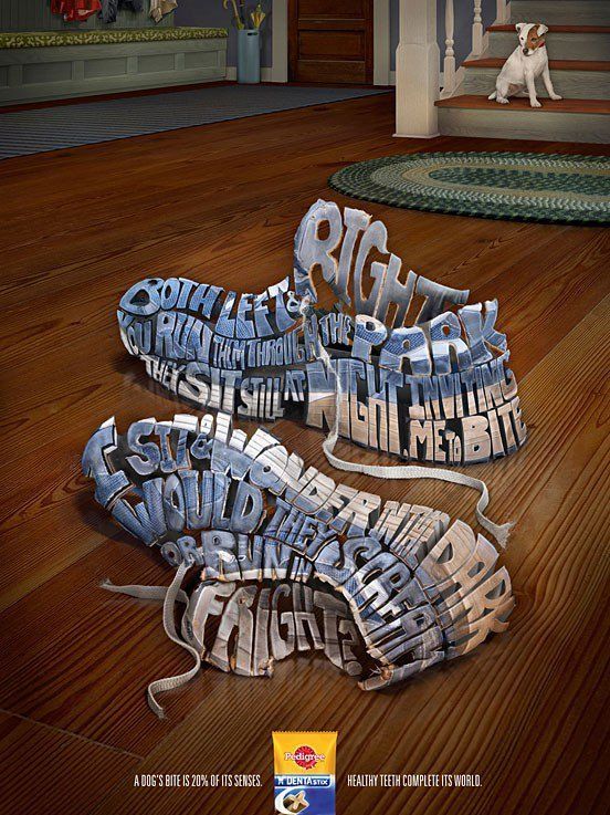
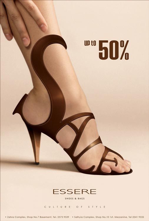
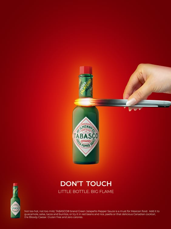
Creating print advertisements with a strong typographic focus allows for visually impactful and engaging designs that not only capture attention but also communicate brand identity in a compelling way.
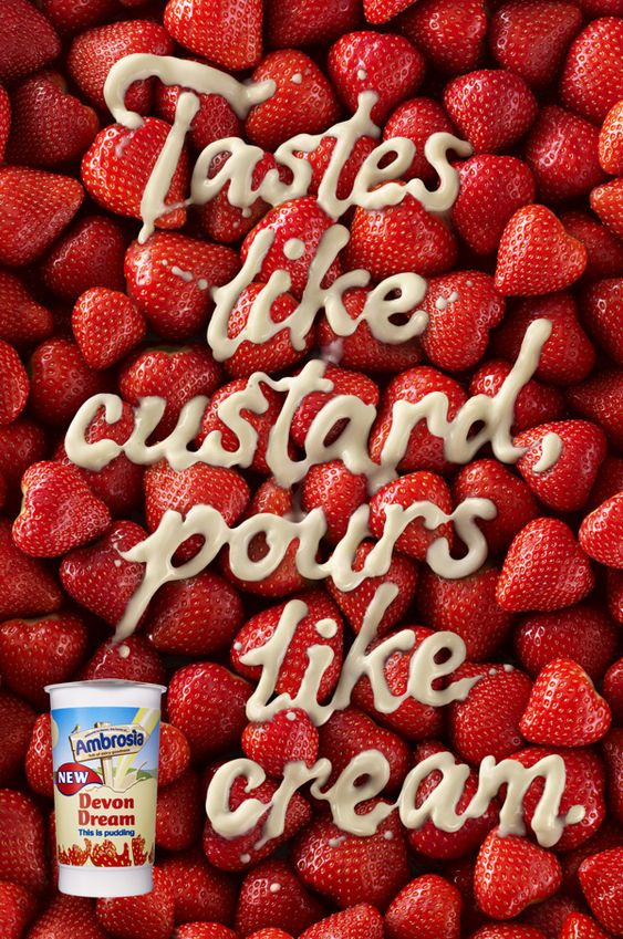
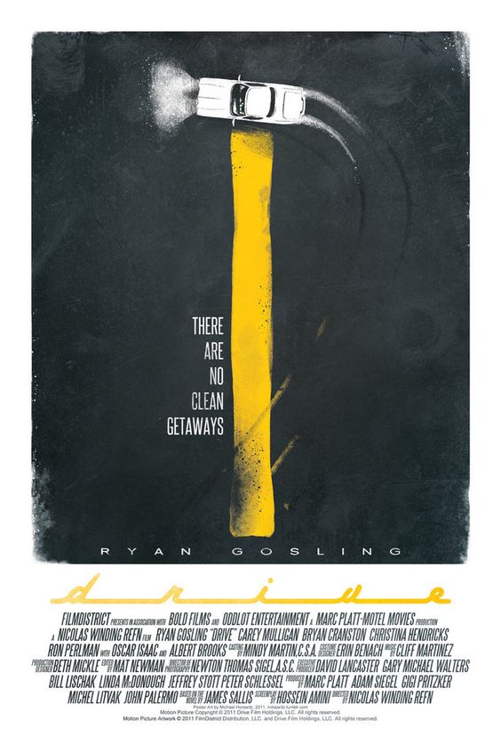
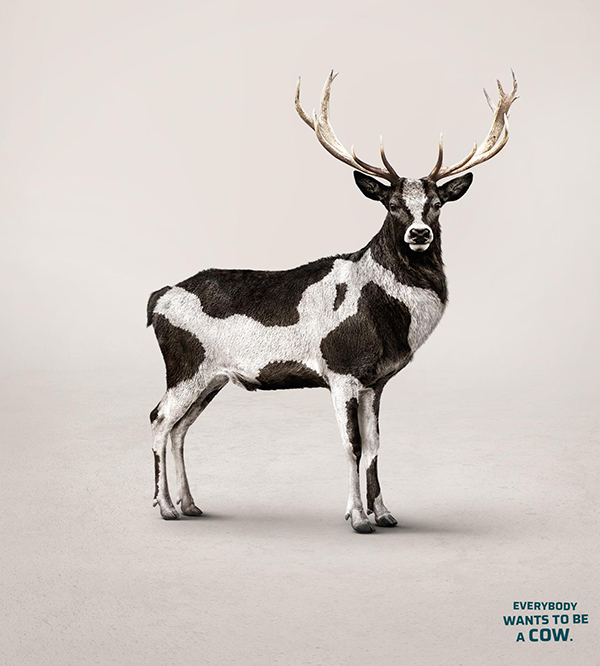
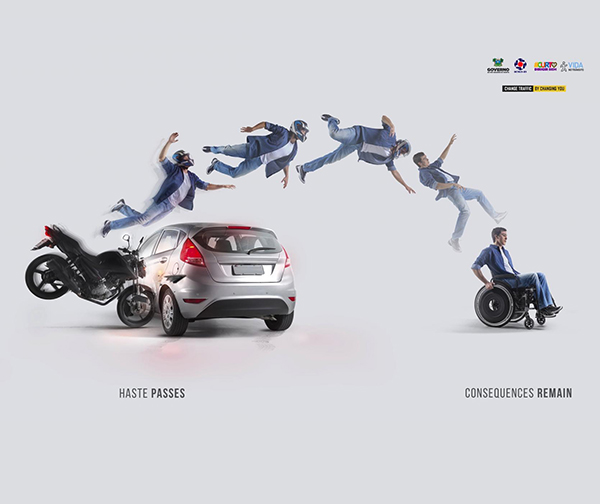
Creating print advertisements with a robust typographic focus allows for visually impactful and engaging designs that capture attention and compellingly communicate brand identity. In this project, you will design three print ads for three brands, using typography as the primary design element. This approach encourages you to explore the power of words, letterforms, and layout to convey each brand’s core message effectively.
By experimenting with diverse fonts, sizes, and arrangements, you will shape how the audience perceives each brand’s voice and personality. Each ad will require you to consider how typography interacts with other design components, such as color, imagery, and composition, to create a balanced and aesthetically pleasing result. The ads should showcase creativity and originality and reflect a deep understanding of how typography can influence consumer perception.
You are encouraged to incorporate handcrafted elements into your designs, whether through paper cutouts, textured lettering, or unexpected materials that elevate the ad beyond the ordinary. Imagine a sleek, minimalist ad where the product name is crafted from intricately folded paper, symbolizing craftsmanship and attention to detail. Or, consider an ad where bold, oversized letters are created from real-world objects, seamlessly blending typography with brand storytelling. The tactile, hands-on approach adds dimension to your work and creates a unique, memorable impression for each brand.
Ultimately, this project aims to explore how typography can be used not just as text but as a vital design tool that enhances the brand message, builds identity, and connects with the target audience visually and emotionally.
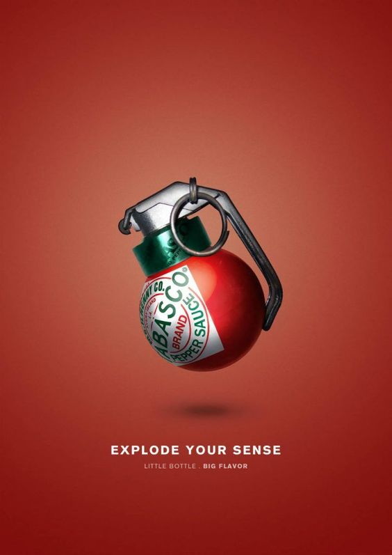
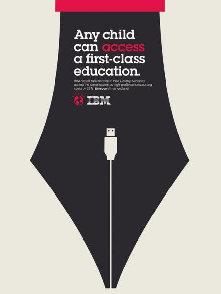
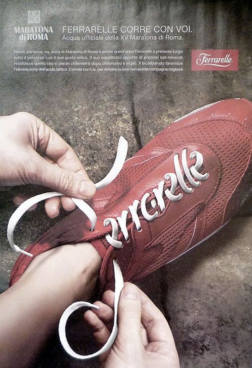
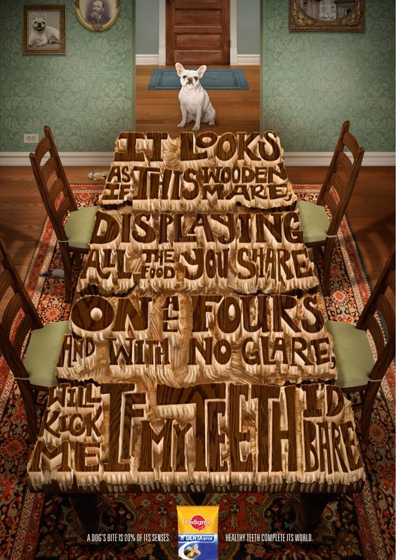
Three Magazine Ad Examples
Magazine Project
Magazine Covers
Infuse your magazine cover with a typographic design style by thoughtfully selecting fonts, experimenting with unique materials, and creating a visually compelling composition that both intrigues and engages your audience.
