DESIGN INSPIRATION
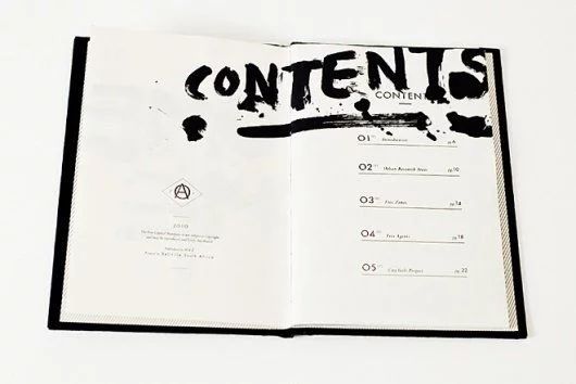
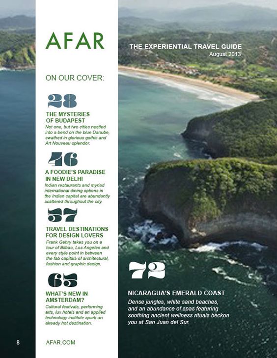
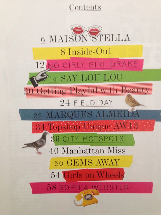
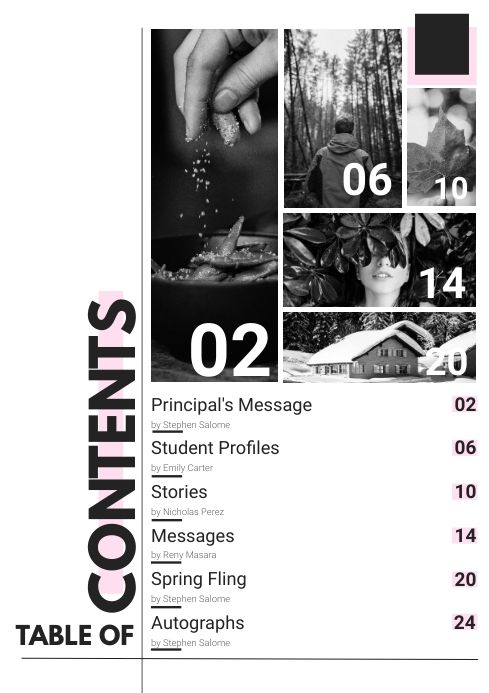
Magazine Table of Contents (ToC)
Creative
Innovative & Fresh
Variety
Explore & Experiment
Grids
Clean & Organized
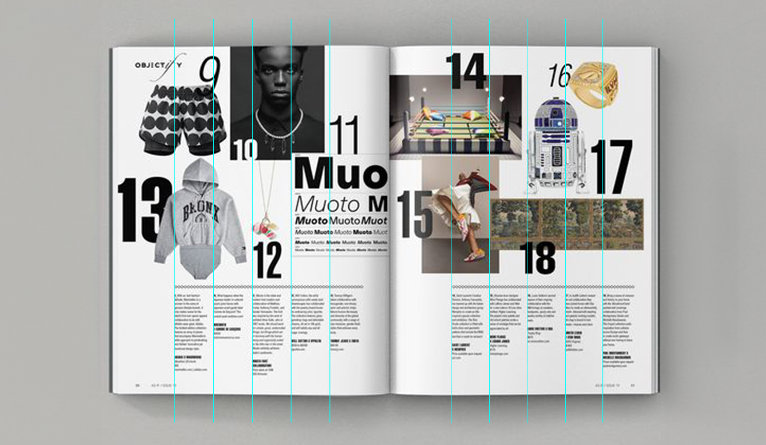
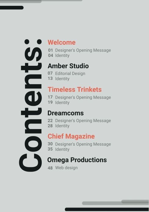
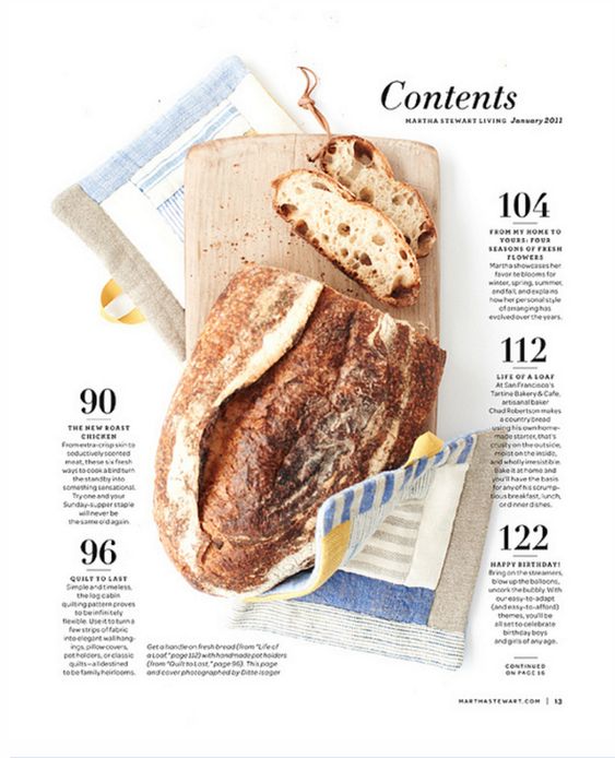
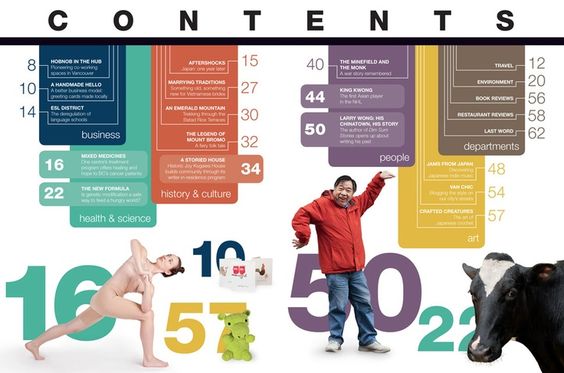
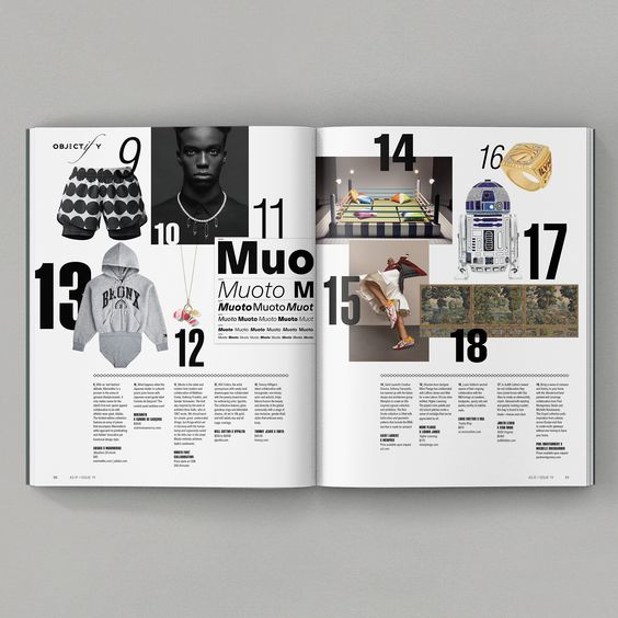
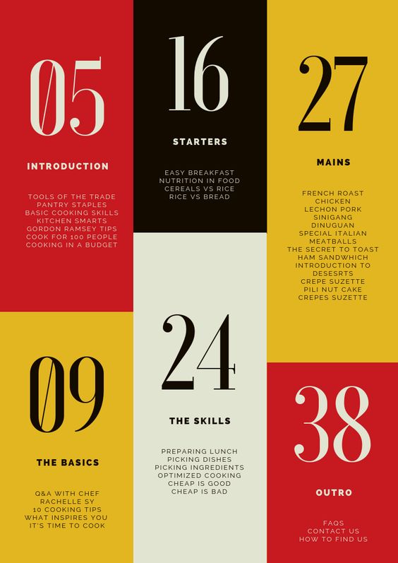
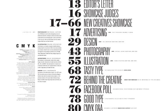
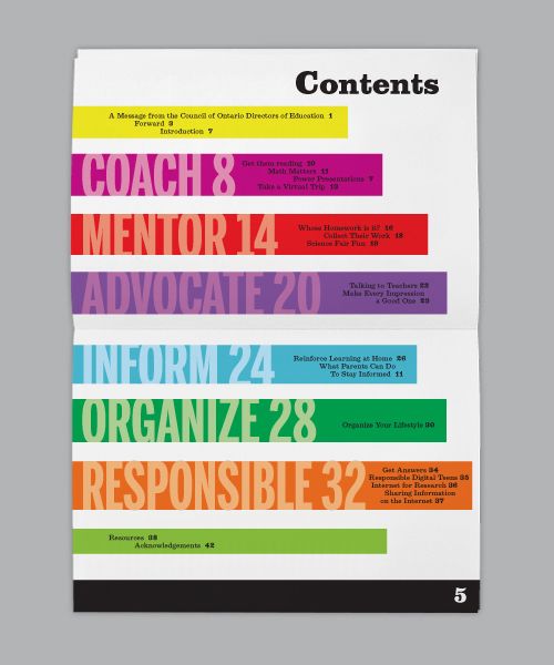
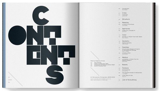
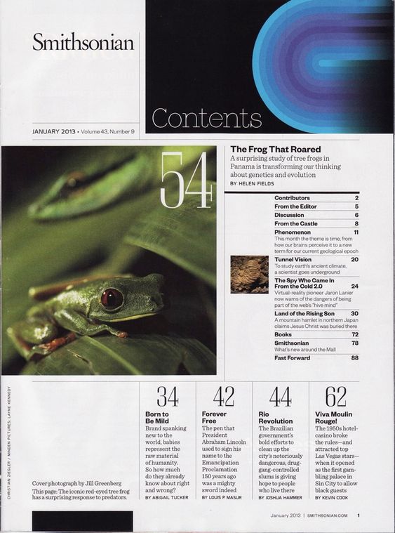
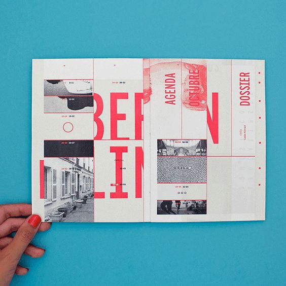
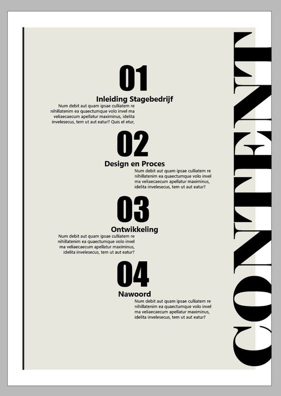
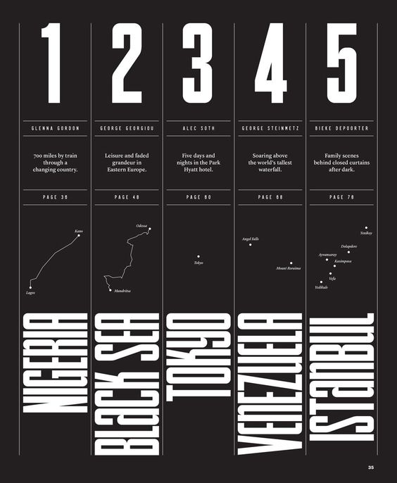
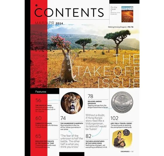
Start by selecting fonts and typography consistent with the brand’s visual language—whether it’s a bold, modern look or something more classic and refined. The key is to make the design cohesive with the rest of the magazine so readers instantly recognize the style.
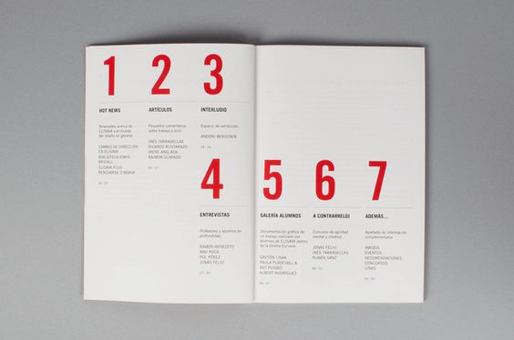
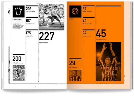
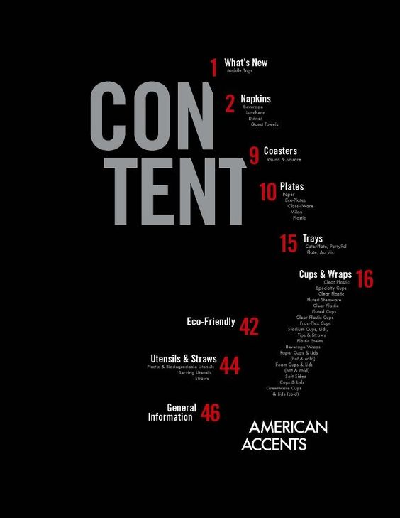
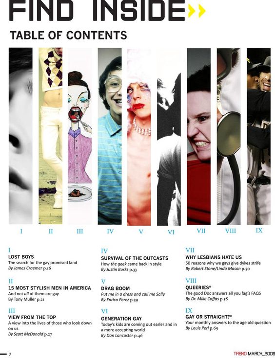
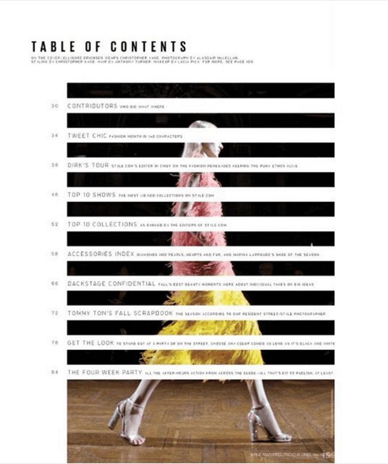
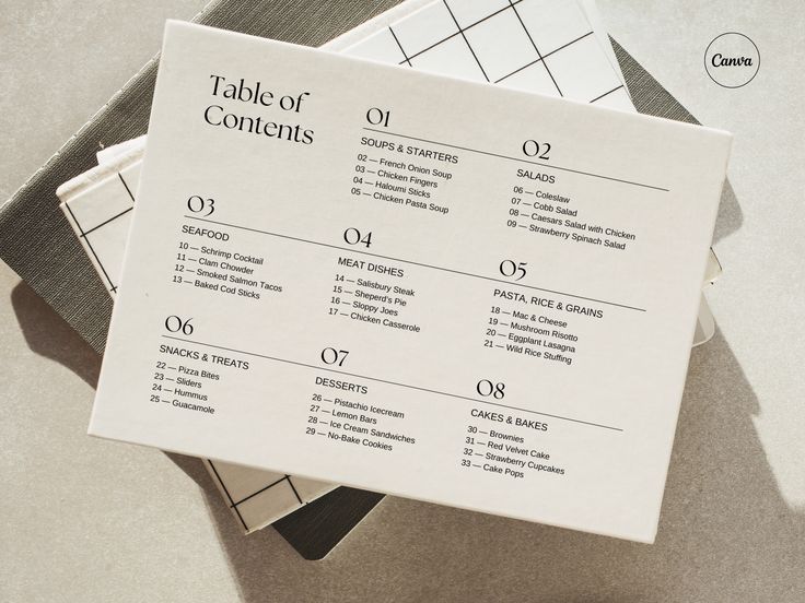
Create a hierarchy within the table of contents by using different font sizes or weights to distinguish section headings from descriptions or page numbers. This helps guide the reader’s eye smoothly through the content, making it easy to find each section. Avoid clutter by leaving sufficient white space, ensuring that the design feels open and inviting rather than overwhelming.
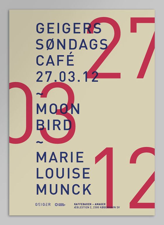
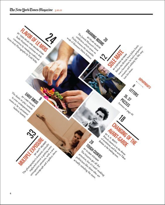
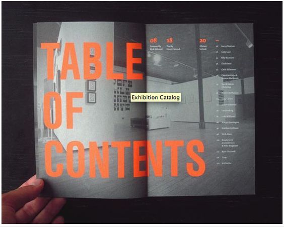
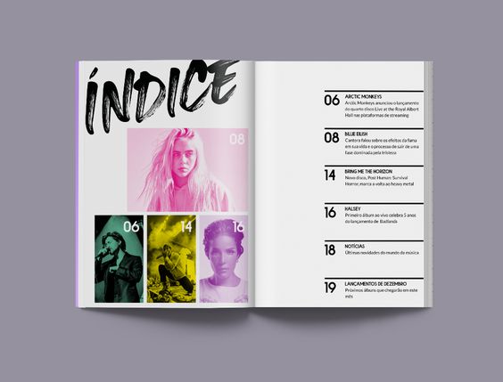
Consider integrating visual elements that reflect your magazine’s brand, such as icons, lines, or even subtle graphic motifs. A grid-based layout will help maintain structure, but don’t shy away from creative touches, like playing with alignment or layering text, as long as they fit within your established brand guidelines.
Your table of contents is the reader’s first interaction with the content, so it should be an extension of the magazine’s overall tone and aesthetic. Keep it on-brand, easy to navigate, and visually compelling to set the stage for the content that follows.
Table of Contents Examples
Magazine Project
Letter from the Editor
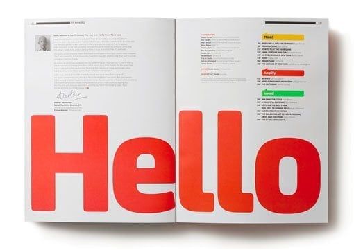
When designing your letter from the editor with a typographic focus, carefully select a font that not only resonates with your magazine’s character but also enhances readability; consider incorporating a personal touch, such as names and photos, to forge a genuine connection with your readers.
