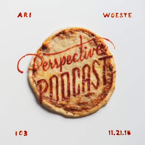
DESIGN INSPIRATION
Food Typography
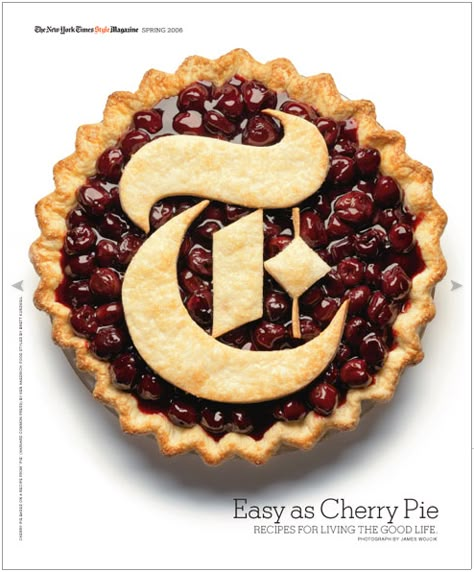
Classic Serif
Timeless & Traditional
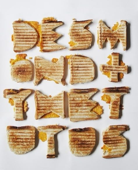
Modern Sans-Serif
Contemporary & Clean
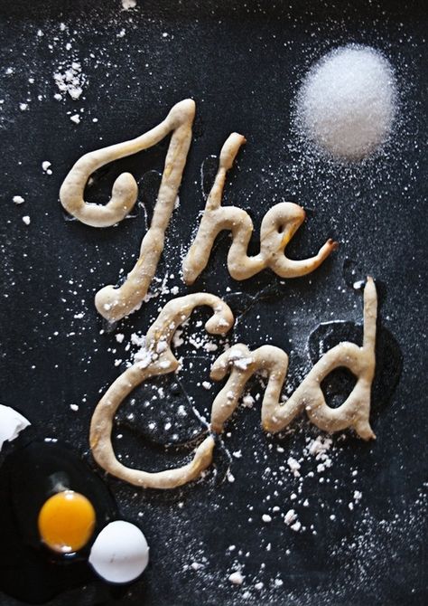
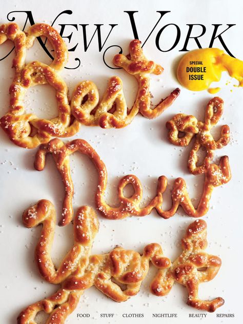
Handwritten
Personal & Approachable

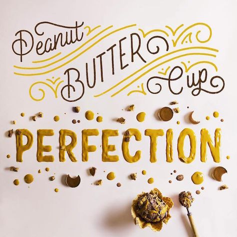
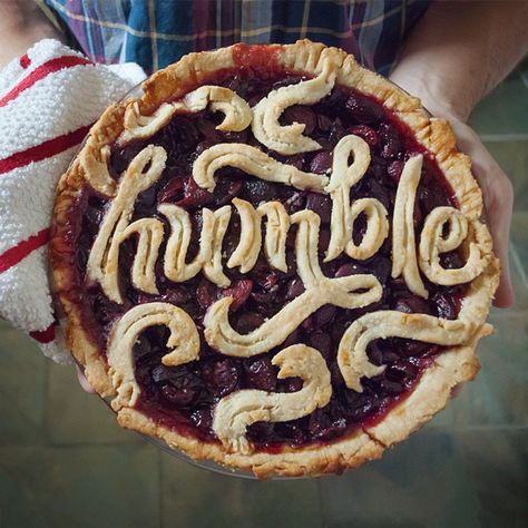
Why Food Typography?
Getting Creative with Food Type
-
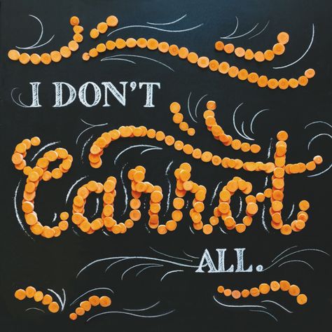
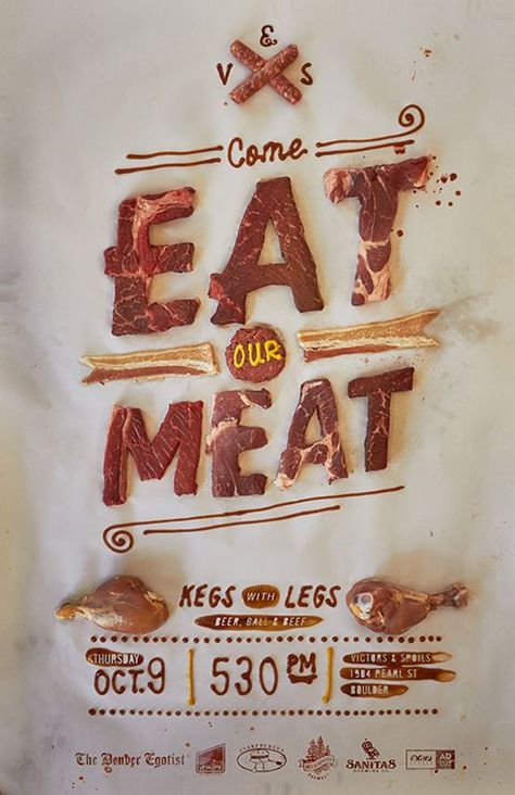
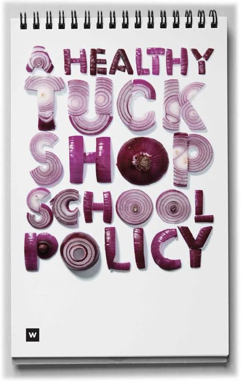
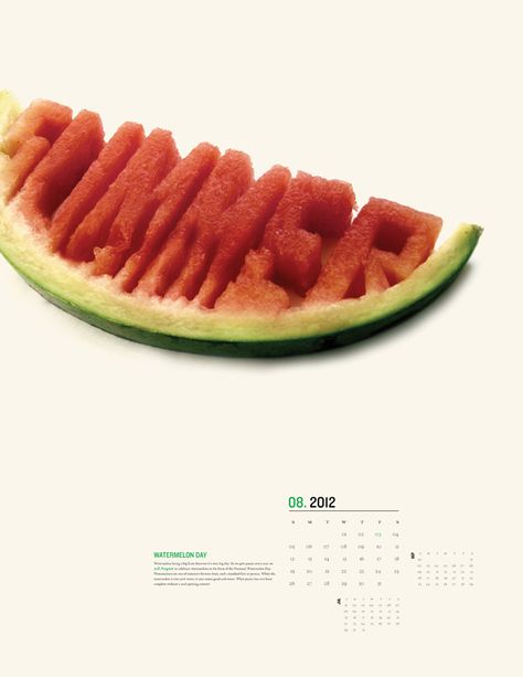
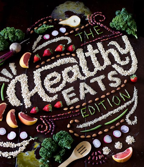
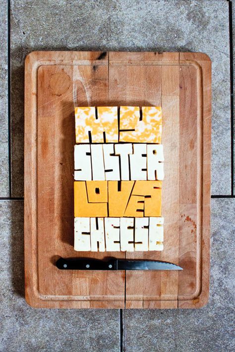
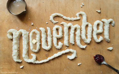
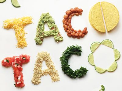
Shape & Structure – Think about the natural form of your chosen food. Can you sculpt letterforms directly from whole ingredients, or do you need to slice, arrange, or layer them?
-
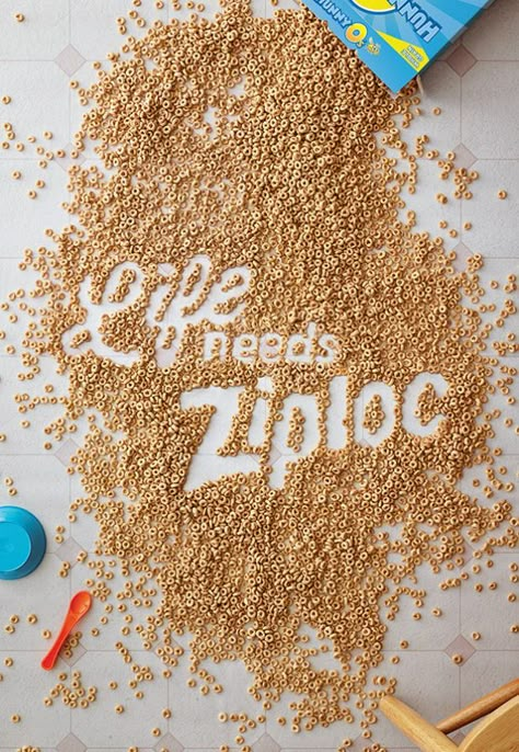
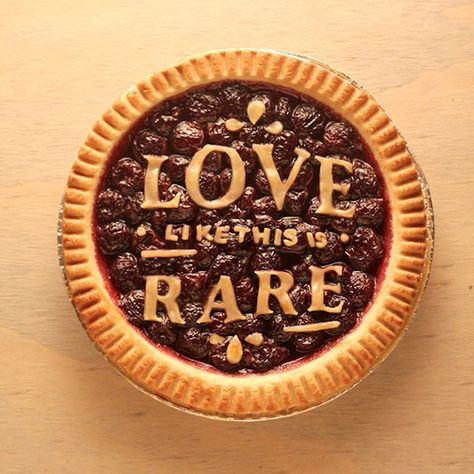
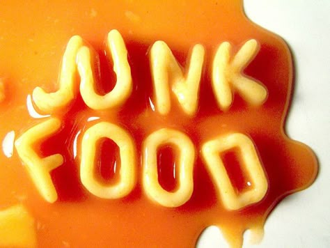
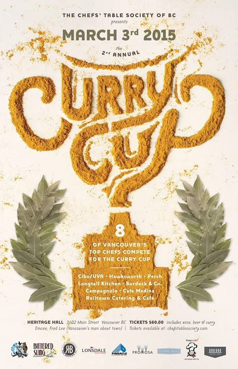
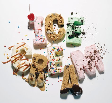
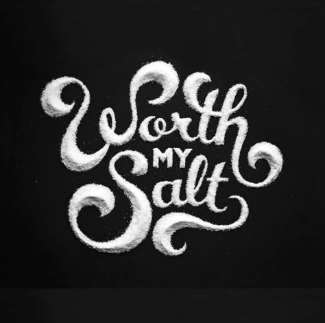
Texture & Dimension – Smooth vs. rough, firm vs. soft—food textures can influence the mood of your typography. Powdery spices create a different effect than chunky vegetables or glossy icing.
-
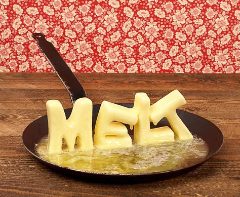
Movement & Decay – Some foods naturally move or change over time. Ice cream melts, leaves wilt, and dough rises. How can you incorporate these transformations into your design?
-
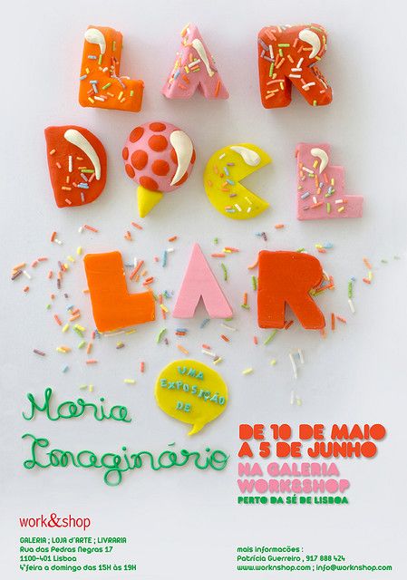
Color & Contrast – Vibrant fruits, rich chocolates, and brightly colored sprinkles offer endless visual possibilities. Use color to emphasize certain parts of your composition or enhance readability.
-
Lighting & Shadows – The way food interacts with light can dramatically change the way your typography appears. Experiment with soft, natural light or dramatic shadows to create depth and contrast.
-
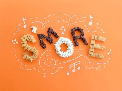
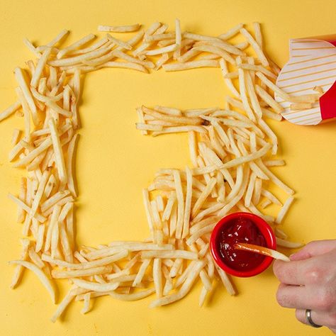
• Firm foods (cookies, pasta, breadsticks, hard candy) hold their shape well.
-
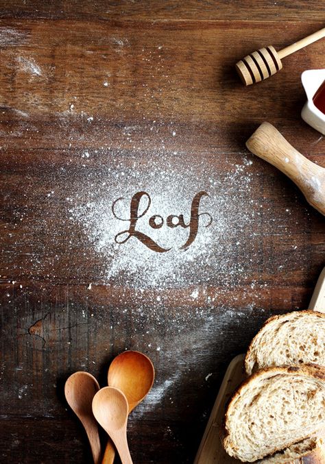
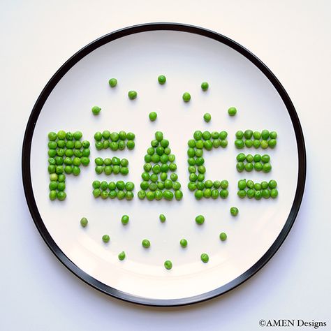
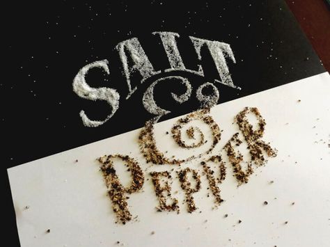
• Loose foods (spices, grains, seeds, flour) allow for free-form designs but require precision.
-
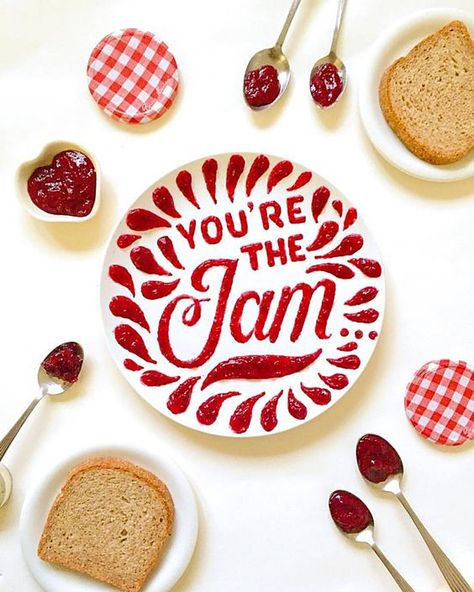
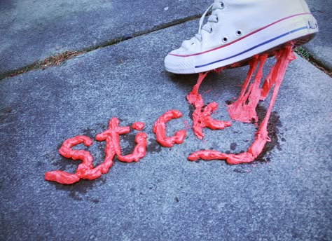
• Sticky foods (syrups, melted chocolate, honey) can be used for fluid, script-like lettering.
-
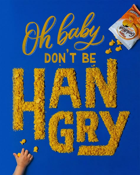
• Fragile foods (chips, crackers, leafy greens) may break or wilt, adding texture but requiring careful handling.
2. Plan Your Layout First
3. Work in Layers
4. Keep Readability in Mind
5. Use Tools for Precision
✔ Tweezers for placing small items like seeds or sprinkles.
✔ Toothpicks or fine brushes to adjust details.
✔ Straws or small syringes to control liquids like chocolate or syrup.
✔ Cookie cutters or stencils to help shape soft materials.
6. Lighting & Photography Matter
✔ Keep the camera steady—tripods or stable surfaces help prevent blurring.
✔ Adjust contrast and brightness in post-processing to refine the final look.
7. Be Prepared for Mess & Imperfection
Food typography is about more than just playing with your food—it’s an exercise in problem-solving, material exploration, and storytelling. Each ingredient carries its own visual and tactile qualities, influencing how the final composition looks and feels. A fluffy pile of flour behaves differently from rigid pasta or melting chocolate, requiring designers to adapt and think creatively.
This project encourages you to step away from the computer and engage with typography in a hands-on, experimental way. By using real-world materials, you develop a deeper understanding of form, texture, and composition while pushing the boundaries of traditional type design.
Successful food typography projects go beyond simply spelling out words with food. They create an immersive experience, where the type interacts with the material in a way that enhances its meaning. Consider these creative approaches:
Tips & Tricks for Food Typography Success
1. Choose the Right Food for Your Design
Not all foods are easy to work with—some are too soft, sticky, or perishable. Consider how different ingredients behave and test them before committing to your final design.
Sketch multiple thumbnail layouts before building your type in real food. This helps you determine spacing, hierarchy, and how to best arrange the ingredients for clarity. Consider how the type will look in a horizontal, vertical, and square composition to ensure a balanced design.
Start with a base layer to define the letterforms, then add details and refinements. If working with small materials like spices or seeds, consider using a stencil as a guide to maintain clean edges.
While it’s tempting to get overly artistic, the most successful food typography projects balance creativity with legibility. If the letters aren’t clear, the message is lost. Take a step back and assess your work from a distance—does the text still read well?
Even though this project is hands-on, tools can help refine your design:
Your final food typography piece isn’t just about the type—it’s about how it’s captured. Use natural light whenever possible, and avoid harsh overhead lighting that creates unflattering shadows. A slight angle can add depth, while a flat lay (overhead shot) gives a clean, graphic look.
✔ Use a neutral background to let the food type stand out.
Food isn’t a digital font—it won’t behave perfectly! Embrace the imperfections, and don’t be afraid to adjust your composition as you go. If an ingredient doesn’t work as expected, pivot and experiment with another approach.
Letter from the Editor Examples
Creative Typography
Food Typography
Food typography blends design, photography, and hands-on creativity into a unique, tactile experience. This project pushes you to think about typography in new ways while embracing the organic, unpredictable nature of real-world materials.
The best food typography designs are not just readable—they are memorable. Experiment, have fun, and create something visually delicious!

